This section is designed with TASO partners and staff in mind, providing rules on chart formatting to ensure consistency across TASO outputs. That said, we anticipate that the insights provided may also be beneficial to anyone interested in developing their own data visualisation style guide, or understanding the technical details behind creating consistently formatted charts.
Formatting rules
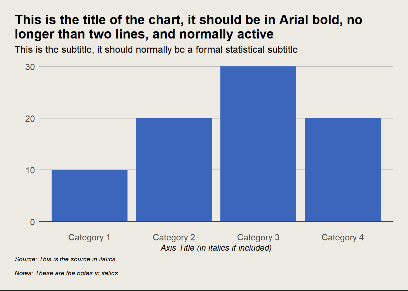
Show the code
library(tidyverse)df <-data.frame(X_Axis_Title =c("Category 1", "Category 2", "Category 3", "Category 4"),Y_Axis_Title =c(10, 20, 30, 20))ggplot(df, aes(x = X_Axis_Title, y = Y_Axis_Title)) +geom_bar(stat ="identity", fill ="#3b66bc") +geom_hline(yintercept =0, linetype ="solid", color ="#404040") +labs(x ="Axis Title (in italics if included)", y ="", title ="This is the title of the chart, it should be in Arial bold, no\nlonger than two lines, and normally active",subtitle ="This is the subtitle, it should normally be a formal statistical subtitle",caption ="Source: This is the source in italics\n\nNotes: These are the notes in italics") +theme_minimal() +theme(text =element_text(family ="Arial"),plot.title.position ="plot",plot.title =element_text(size =16, face ="bold"),plot.subtitle =element_text(size =12),plot.caption.position ="plot",plot.caption =element_text(hjust =0, size =8, face ="italic"),panel.grid.major.x =element_blank(),panel.grid.major.y =element_line(colour ="grey"),plot.background =element_rect(fill ="#EDEBE3"),plot.margin =margin(0.25, 0.25, 0.25, 0.25, "in"),axis.text.y =element_text(size =11),axis.text.x =element_text(size =11),axis.title.x =element_text(size =10, face ="italic"))
You can find an example R script for creating charts with TASO styling on our GitHub. R is a widely used statistical software among researchers and data analysis. You can also find useful resources for data visualisation in R in the R resources section.
The font for the charts is Arial. Ensure that font sizes always remain readable. If there is text you must include but you are finding it is too small, consider how you can redesign the chart. For annotations and data labels, if you are to use bolding or italics, use them with purpose.
The title should normally be an active title that conveys the key takeaway, and should always be the largest text on the page. The title should be in bold, size 16.
The subtitle should be a formal statistical title (as you might traditionally title a chart). The subtitle should be size 12.
The caption should be in the bottom left of the chart. It should be in italics and size 10.
Text sizes can have some flexibility. But ensure that the title is the largest text on the page, followed by the subtitle. Ensure all other text is smaller than the title and subtitle.
Colours
The text should be black, but adjust as appropriate for readability. For example, sometimes data labels will need to be white to stand out against colours.
Background should be #EDEBE3 (putty).
Gridlines should generally be #E4E2D9 (darker than the background but lighter than text and lines). Gridline shade can be adjusted if it aids readability, but it should be a shade of grey.
Format
180mm (width) x 120mm (height) is the default standard chart size for A4 PDF reports. 180mm is the maximum width, however, the height is flexible depending on the chart. For example if your chart needs to be tall rather than wide.
Save as a PNG or a JPEG to avoid losing quality through copy and pasting or screenshots.
If you are including the logo, it should be in the bottom right corner, with sufficient space around it as per the brand guidelines. The logo is not needed in PDF reports that already contain TASO branding. However, consider including the logo for web/social media versions of charts, where the chart is taken outside of the context of the report.
Brand colours
#07dbb3#3b66bc#e4e2d9#edebe3#f9466c#485866
Note
You can use RColourBrewer to generate gradients in R. Alternatively, you can use this website to modify the brightness and colour intensity, and choose the number of colours you want to generate.
Ensure foreground and background colours contrast enough to pass the WCAG AA standard. You can check the colour contrast here.
For more in-depth guidance on accessibility, we recommend the accessibility sections of the Government Analysis Function data visualisation guidance and the Royal Statistical Society data visualisation guide.
At TASO, we will be looking further into how we can improve the accessibility of our charts, particularly around the use of accessible colour palettes.
For alt text, Amy Cesal1 provides some useful guidance on how to write alt text for charts, including the following formula to help:
Chart type of type of data where reason for including chart
Alt text example
Bar chart of the average earnings of students by highest qualification where students who went to a top third university earn the most